
In summary...
The cross tables chart allows you to present two key elements of your data together, understand the significance of volume data in a crossover, and compare against other datasets in the chart.
You can see:
- The total number of data points within each individual input (e.g. the number below EasyJet in the image above);
- The total number of datapoints that exist in both row and column as a percentage of the row input dataset (e.g. the yellow-marked percentages in the image above);
- The total number of datapoints that exist in both row and column as a percentage of the column input dataset (e.g. the blue-marked percentages in the image above).
All data volumes and percentages are calculated using the filters that are applied.
The detail...
Let's take a look at each piece of data shown on a cross chart.
Total volume of input
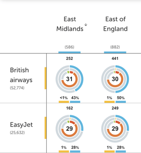
In the example on the left, you can see that we show numbers underneath each input.
These numbers are the total number of data points that exist in that input's dataset with the filters (date range and other filters selected at the "filters" step of visualisation creation) applied.
So, using the example on the left, you can see that there are 52,774 datapoints in the British Airways dataset, taking into account the date range and filters you applied.
Column volume (%)
Column volume shows you the volume as a percentage of the column input dataset.
In the example on the right, you can see that although 252 may seem like a small dataset, it's actually 43% of your East Midlands data.
This will hopefully enable you to better understand the significance of the volumes you are seeing in the cross tables and to compare them more easily.
Row volume (%)
We also show the volume as a percentage of the row input dataset.
In the example, we can see that the 252 people talking about British Airways in the East Midlands are a tiny fraction (less than 1% to be exact!) of all people talking about British Airways in this dataset.
Sentiment
The aggregated sentiment score of the data in the crossover is shown in the middle ring. For example, comments from those in the East Midlands about British Airways have an aggregated sentiment score of 31.
Snazzy toggles for easy viewing of different data
![]()
It's easy to remove data types that don't interest you.
For example, if you don't care about the sentiment data, you can unselect it, and it will disappear from the chart. Voila!
More questions?
We’re always happy to chat. Reach out using the help bubble at the bottom of your screen, or contact your Customer Success Manager.
 ✍️ Article written by: Zoe, Customer Success Manager